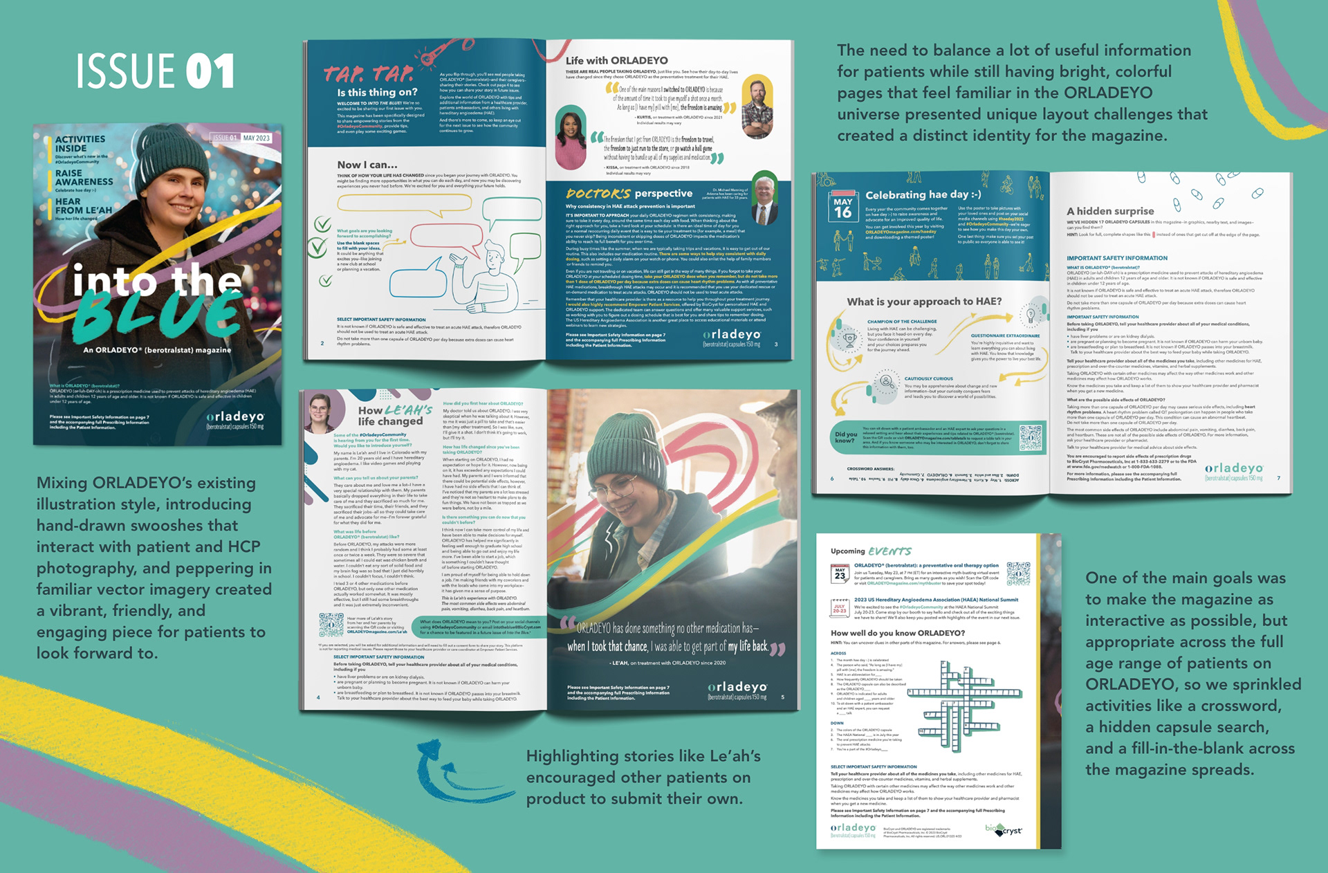
One of the most exciting projects I have gotten the privilege to create is the Into the Blue magazine, which was a 2024 Pharma Choice Award Silver Winner in the DTC/DTP category. Constantly looking to expand the brand, our team wanted to create an interactive piece patients could not only have fun reading, but also gain more insights into the ever-evolving ORLADEYO community. We originally pitched this tactic as an adolescent piece that could be similar to a Scholastic Highlight's magazine, but it quickly evolved into the magazine you see today; appropriate for patients of all age ranges.
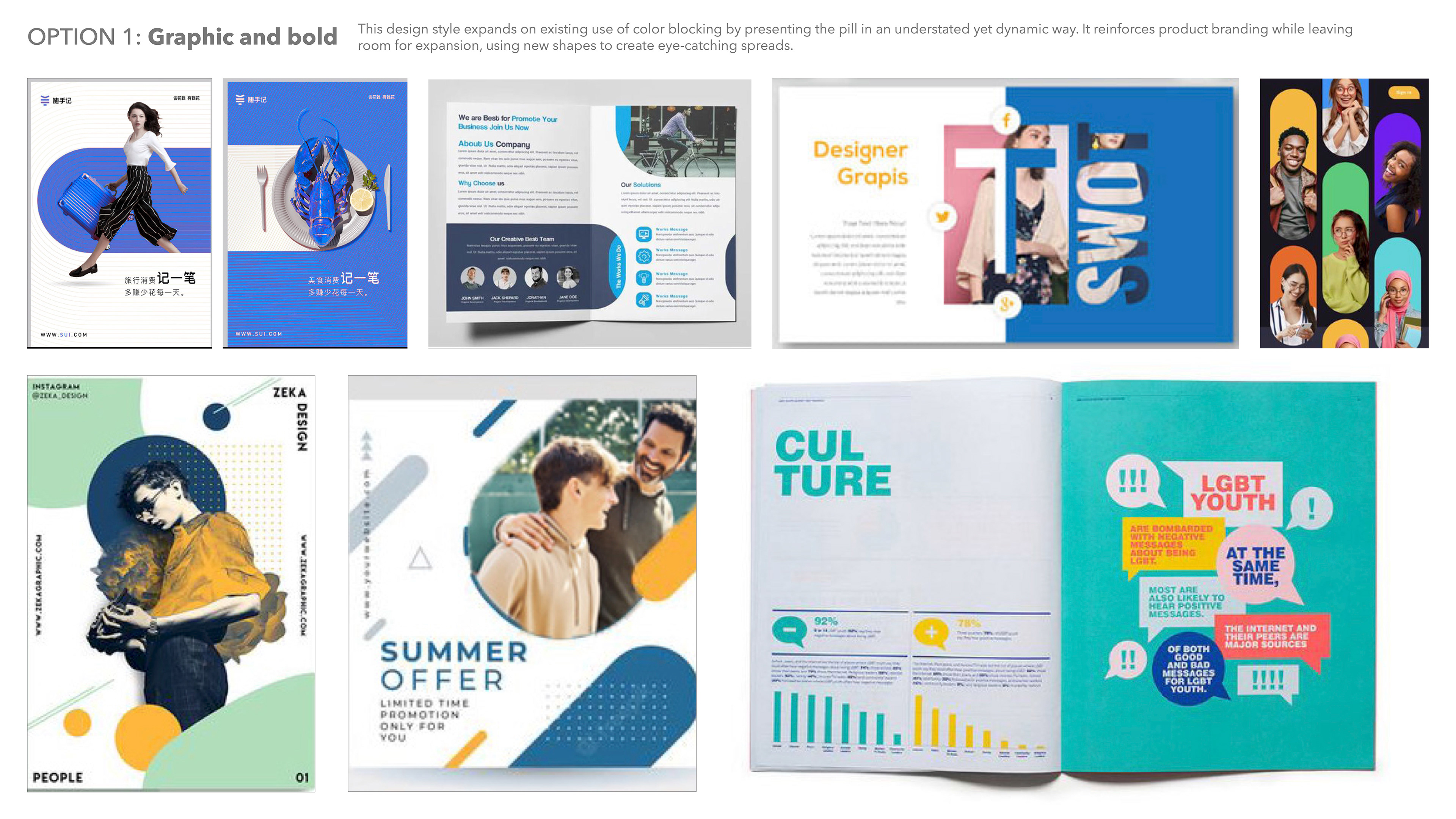
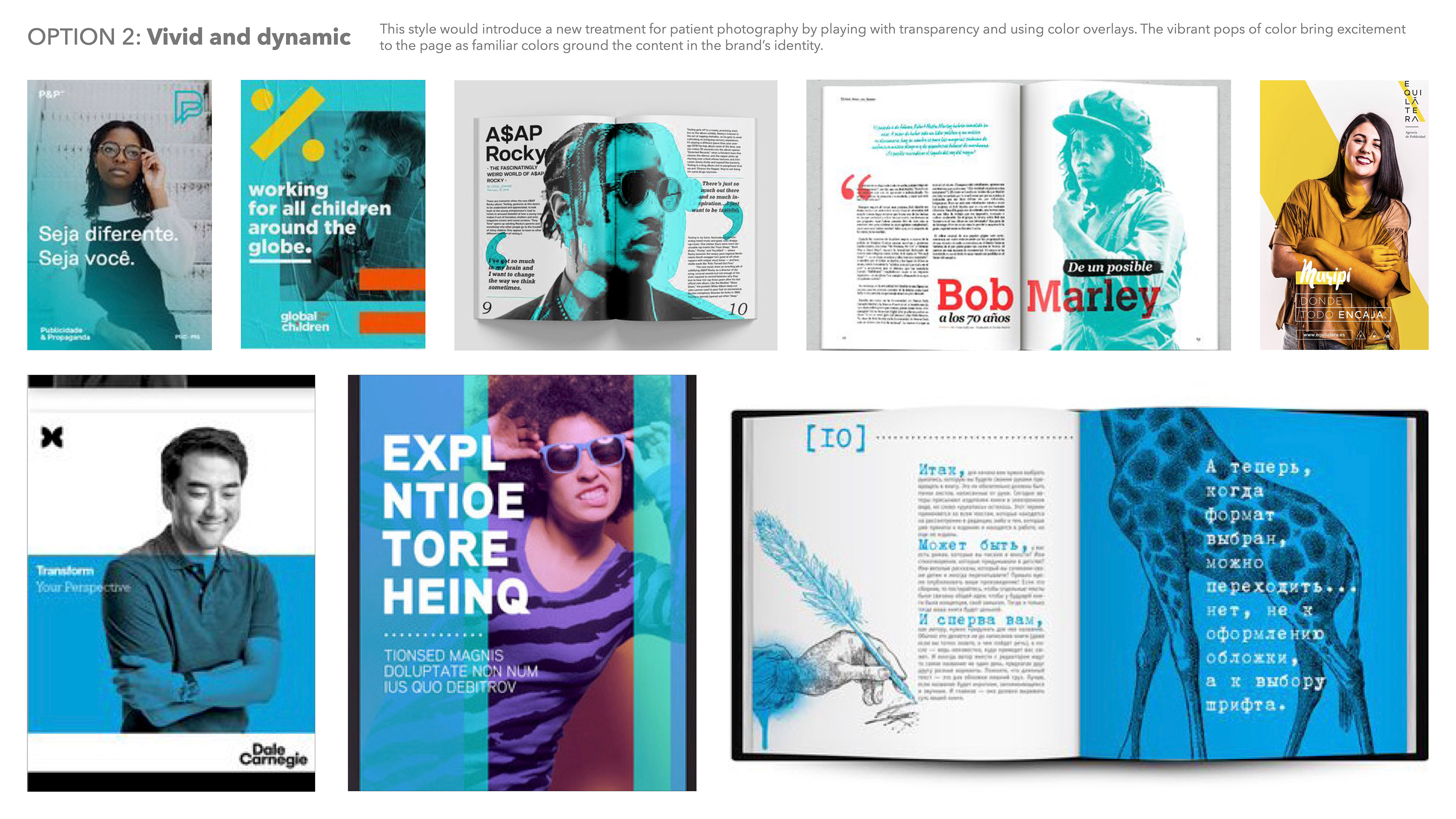
We knew the magazine should have its own distinct look and feel, but still fall under the umbrella of ORLADEYO's brand so it would be familiar and relevant to our patient audience. I created three moodboards for the client to reference and presented them as different design directions the magazine could go in. The client choose to combine options 1 and 3 from the moodboard swipes below and to move forward with a mix of bold, graphic, color blocks and shapes paired with hand-drawn elements and illustrations that interact with photography.

After deciding on a style and content direction, my copy partner and I set to work creating the magazine itself. It needed to be enticing, exciting, and feel like a refresh of ORLADEYO's minimalist and clean style. Drawing in Procreate and then exporting my work to photoshop allowed me to create these unique swooshes highlighting and encircling the patient in a way that stands out compared to the brand's other existing materials.
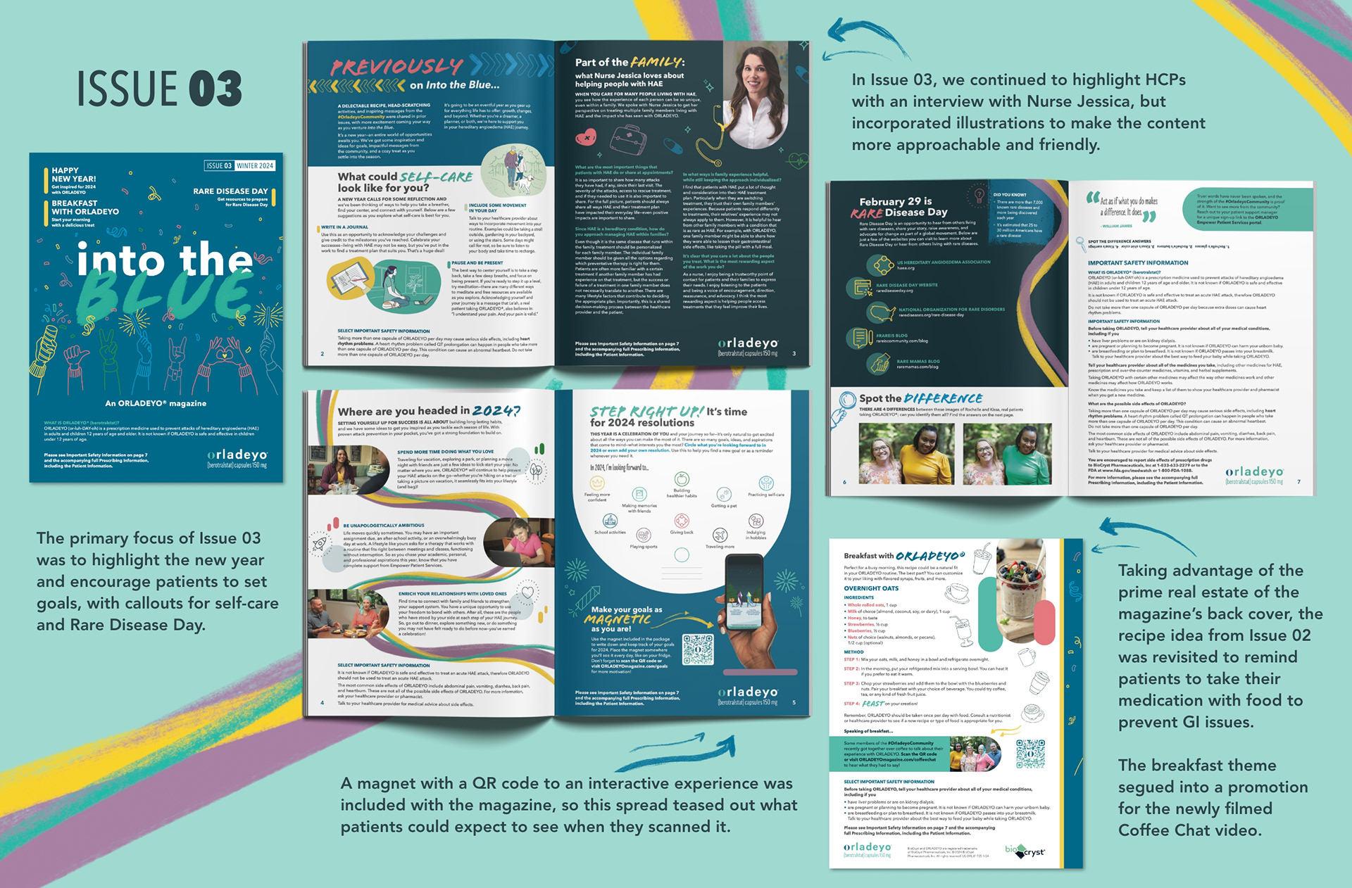
Issue 01 garnered such success with our patient audience that the client was eager to continue the project and release more issues of Into the Blue, so Issue 02 was mailed to patients in fall of 2023, and Issue 03 in winter of 2024. The goal is to release issues once a quarter and create a collectable series for patients to enjoy.