For this campaign, I worked with our omni-channel team to create a fresh and dynamic mini campaign targeting caregivers of adolescents and young adults. We faced the challenge having three different audiences to reach (caregivers, young adults aging 18-25 years old, and adolescents under 18 years old), all with unique and distinct tastes of what look and feel would cater to their preferences. The campaign needed to be cohesive and separate from traditional ORLADEYO marketing, but also easily recognizable as part of the brand. We also couldn't target adolescents directly for ethical concerns, so trying to target them indirectly while also creating content that was palatable for their caregivers presented a unique challenge when deciding style and direction of the campaign.
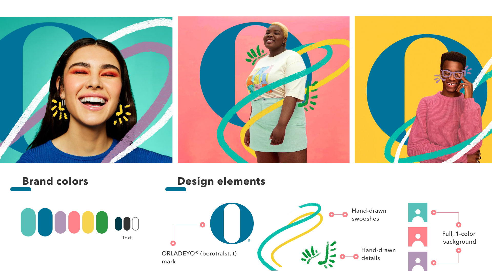
I started by first grounding our client in what materials existed already in the ORLADEYO universe that we could leverage and pull through into this campaign; full color backgrounds with patient imagery, hand-drawn swooshes, and our increasing use of the ORLADEYO "O" mark.
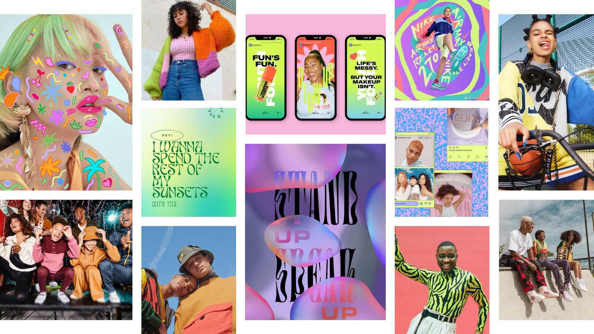
I then presented a moodboard of current trends, imagery, and visual direction that was common and successful when marketing to a young adult audience, and what would be a familiar and approachable direction; bright, bold colors; gradients; Y2K or retro styling; individuals expressing themselves through hair, makeup, or fashion; and authentic photography showcasing everyday activities.
I then presented a moodboard of current trends, imagery, and visual direction that was common and successful when marketing to a young adult audience, and what would be a familiar and approachable direction; bright, bold colors; gradients; Y2K or retro styling; individuals expressing themselves through hair, makeup, or fashion; and authentic photography showcasing everyday activities.
Pulling from all of our existing materials as well as keeping in mind what was attractive to a younger audience, I presented two visual approaches to the client; how our Adolescent Campaign could look for our 18-25 audience, and how it could look for our caregiver audience.
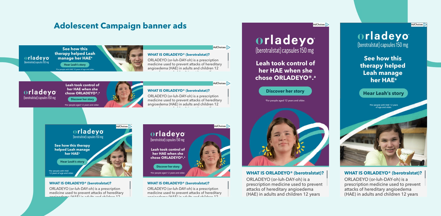
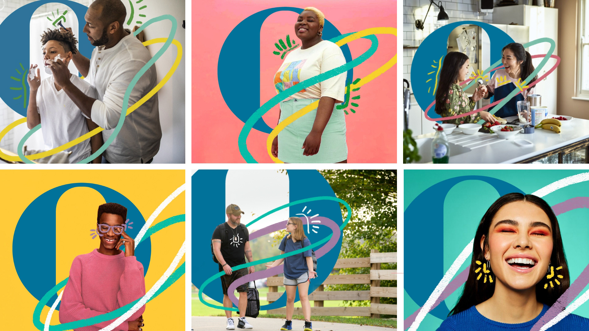
For the younger audience, I implemented our existing full, 1-color background established in traditional ORLADEYO branding, but introduced the use of our secondary palette as the background color to add vibrance and differentiate it from existing materials. Having the patient stand out in a studio shot brought them to the forefront in an empowering and bold way, encouraging patients to take charge of their treatment journey and advocate for their own goals.
I also wanted to incorporate the hand-drawn styling we used in the magazine to add energy and motion to the patients, and included accent details on things like earrings or glasses to really highlight the individuality of the patient. Using the "O" mark in the background was something we hadn't explored in existing branding, but wanted to integrate into the imagery behind the patient to ground viewers in the branding and help immediately recognize the ORLADEYO brand.

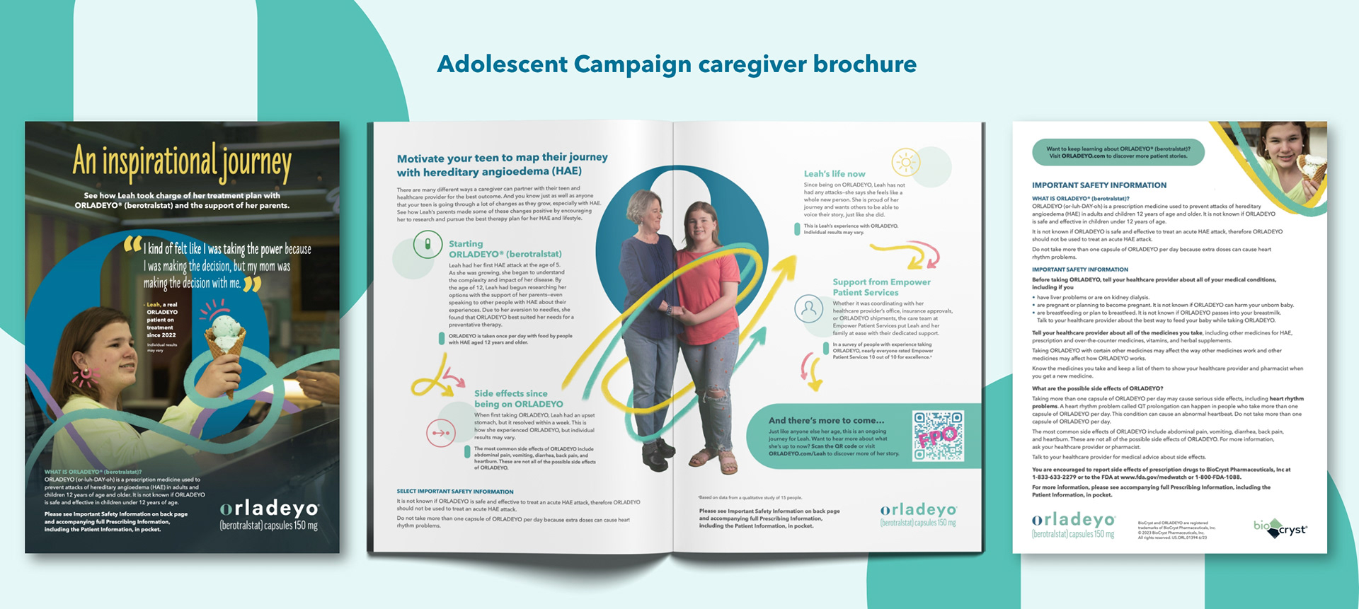
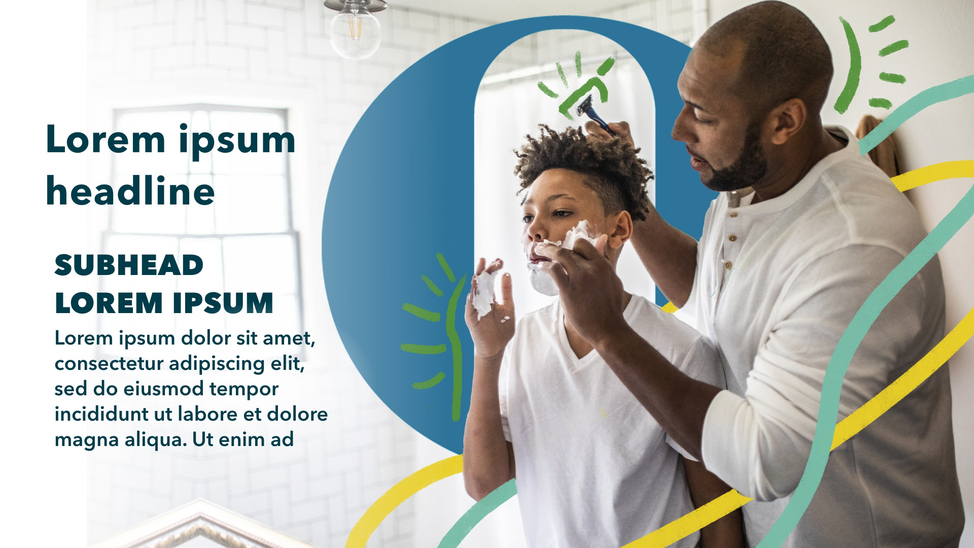
For our caregiver audience, it needed to feel cohesive to the look and feel used with the younger audience, but also had to cater to an older audience's preferences on visual styling. Our more mature audiences and caregivers of patients respond well to lifestyle photography and scenes from everyday life, so including that here was crucial. I pulled through the hand-drawn swooshes and "O" mark element to visually tie the campaign together and unify it.

Once we had client alignment on our proposed campaign direction, we set to work creating a series of tactics used at conferences, on socials, websites, and targeted banner ads to bring the campaign to life.